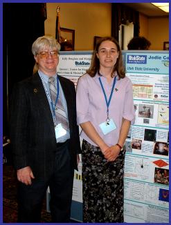
General Guidelines for Poster
Production
In contrast to an oral presentation,
a “poster” is a visual representation of the research project that must convey
the essence of your message. In effect, it “talks” for the researcher. The poster
presenter is on hand to answer questions and provide further details.

General Format: While posters are not uniform
in format, generally, most of the following will be included.
·
Title
telling the name of the project, the people involved in the work, and their
affiliation. The title should be large, descriptive, and concise.
·
Abstracts stating what you set out to do, how you have done it, the key results,
and the main findings and conclusions.
·
Introduction that includes clear statements about the problem that you are trying to
solve, the new ideas or items you are trying to discover or create, or the
proofs that you are trying to establish. Note the background work that has led
up to the current status of your research of creative work in this area. These
should then lead to declaration of your specific project aims and objectives.
·
Theory or Methods section that explains the
basis of the techniques that you are using or the procedures that you have
adopted in your study. You should also state and justify any assumptions, so that your results
can be viewed in the proper context.
·
Results section to show illustrative
examples of the main results of products of your work.
·
Conclusions section that discusses the
main findings of your investigation and their value.
·
Further Plans section that contains
recommendations and thoughts about how the work could be continued. What kind of things could be
done next? What are some possible long-term goals or outcomes?
·
Acknowledgements section that allows you to
thank organizations that might have provided financial support or the
individuals who donated time to help with the project.
Design:
·
Keep the material simple and concise with plenty of white space.
·
Use colors sparingly to emphasize, differentiate, and add interest. (In
general, it is better to keep the background light as people are used to that.)
·
Pictures, graphs, and charts can be helpful in communicating a message
quickly. Equations should be kept to a minimum, be large enough to read, and
accompanied by definitions to explain significance of each variable. Label any
diagrams and drawings. Clipart may be used for interest as long as it’s not
distracting.
·
Font size should be such that a reader can stand at a distance of 5 feet
and read the text. Typically, nothing
less than 20 point fonts should be used.
·
Use underline text, bold face, italics,
or combinations to emphasize words and
phrases.
·
Spelling counts. (Typographical errors do not reflect well on credibility
or the presenter or on the university.)